| |
|
|
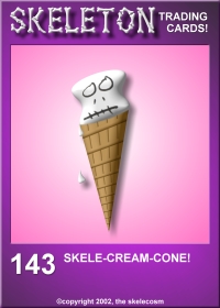
| This
one...ugh...I was running low on ideas...I actually posted it as
#143, but then retracted it. Looking back now, it's replacement
is perhaps even worse...oh well...you never know til you try I guess... |
 |
 |
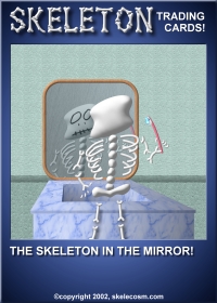
Started
around the 150's period, this guy is actually very inspired—off-beat
and right at home in the Skelecosm, but never finished.
The reflection in the
water just wouldn't come out right and I finally gave up and moved
on to the next one...
|
| I
wasn't really sure why he should be depicted brushing his teeth
in the morning in the first place, and the geometry of the bathroom
sink wasn't working out very well, and, and...oh well... |
 |
 |
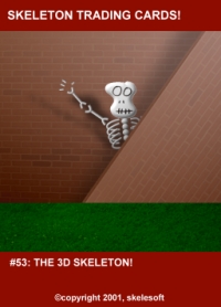
Indeed,
this was to be the very first "3D" processed skeleton
to publish.
But as you can see,
his environment suffers from a lack of 3D perspective, which is
highly contradictory...and so he promptly vanished in a puff of
logic.
|
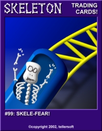
Ok...so
I was in a hurry to get to 100 at the time, and this guy just
wasn't cooperating. He screamed "filler" more than he
screamed about the roller coaster. I never even bothered to apply
an "EEEAAAH!!!"
Personally, I think
the real #99 is a vast improvement.
:)
|
 |
 |
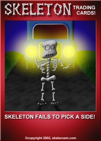
Completely
finsihed, the overall composition of this one just bothered me somehow.
The truck looks really plastic and goofy and I'm never happy with
the grass (sadly, a couple of published ones have terrible grass).
Plus the skeleton himself is necessarily under-exposed and well,
it just didn't work... |
|
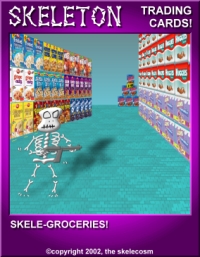
Never meant to be.
Here I was just playing
with boxes of cereal. It never quite came together, and the skeleton
shown is just a placeholder—I never drew one for this card.
|
 |
 |
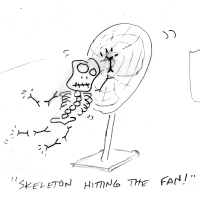
"Skeleton hitting the fan."
Just a sketch I did...seemed like a good joke...I just never got
around to mastering him into a real skeleton. I may yet...
|
|
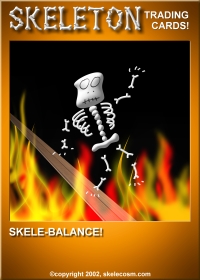
Simply
unfinished, the fire wasn't cooperating with me that day and I
couldn't muster just what the symbolism was supposed to be...balancing
what? Who knows...
This one's really rough,
but it's interesting that a lot of the best ones started out this
crudely and finally made the cut after some very painstaking fine-tuning. |
 |
 |
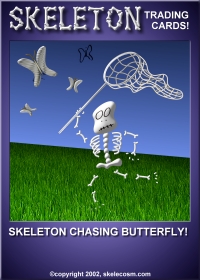
Cute and almost finished, but not
quite. It's that darn grass...I'm never working with grass again!!!
Seriously, that horizon looks horrible!!!
|
|
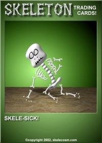
Skele-sick?! Actually this was a
good-looking card and it made you wonder if a skeleton might get
sick seeing how he has no stomach and all...the fact is, I simply
never finished posing him in the about-to-throw-up position, and
then I forgot about him...oh well...
|
 |
 |
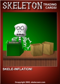
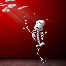
Roughly complete, when it was all
said and done, you couldn't really see that the cash register
said $50,000,000 unless you put the card under an electron microscope.
:(
|
|
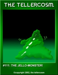
This here is one of the better ones
from the lost Jello-Monster series. I was going down a tangent
of broadening my scope with other "monsters." After
about 20 of these, I realized that I was diluting the skeletons
with this crap and had better re-think my focus.
No regrets...it was
a risky move, and I'm proud of the fact that I was willing to
go ahead and fail. You never know til you try!
|
 |
 |
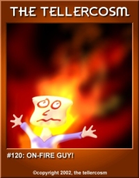
"On Fire Guy" here sat in with the Jello Monsters
mentioned above...there was also a "fried egg monster"
too...sigh...
|
|
This was supposed to be "Skele-taxes." Get it? It cost him an arm and a leg! Hehe... right.
|
 |
 |
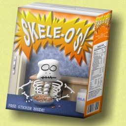
This one actually came out pretty well, and I liked the idea of using a previous skeleton for the picture on the box...but...hmm...actually I don't know why this one didn't publish. It seems fine. ::shrug::
|

